22 Awesome Information Architecture (IA) Tools for Creating Visual Sitemaps
- Last Edited April 17, 2026
- by Garenne Bigby
Information architecture is known to be the structural design of environments of shared information. In general, it involves a concept or model of information that is applied to activities that will require specific details of intricate details of a complex information system. It is the way that content is organized and then categorized on a website. Many people think of information architecture kind of as “buckets of information” that will make up the sections within the website. Then, the concepts or content that can be grouped together will go into the same “bucket”. All websites have their own information architecture, but do not encounter the same problems, although most of them actually have holes in their information architecture or poor IA altogether, causing navigation difficulties for website visitors. Having a great information architecture and sitemaps will ensure that the maximum amount of website visitors will be able to find what they are looking for, thus improving your conversion and website ROI (return on investment).

Information architecture tools will provide a valuable insight to a website regarding how it is arranged. It is vital at any stage of a website’s life cycle, starting at invention. That being said, the best time to start thinking about information architecture and site mapping is before the website is even built. This will save time and money in the long run, and will give a better idea as to what is where and where to add future projects. A sitemap outlines a website in a skeletal form—indicating where content is on each page. Using tools to create sitemaps will lend to an easier task overall. Knowing your information architecture and sitemap will also lend to making a website more accessible. When you view your information architects and sitemap, you will be able to see where your site is heavy on the content and where it is a bit light. This will give you a heads up as to where you are best suited to add content or potentially rework your existing content so that your website is more evenly distributed.
Information Architecture Tools
1. DYNO Mapper
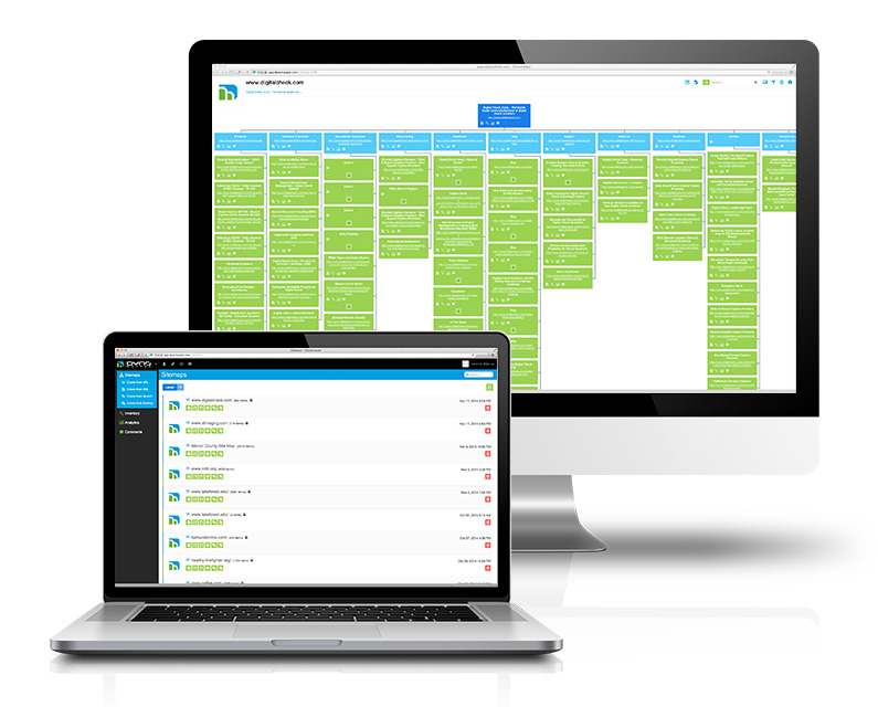
This visual sitemap generator is more than just that—sure you can create, customize, edit, and share your interactive sitemaps, but you will also be able to take care of your content inventory, content audit, and keyword tracking. Integrated with Google Analytics, display and share all of the most important data related to your website. Collaboration is made easy, and testing Website Accessibility will ensure that your website is up to standards that make it accessible to everyone. DYNO Mapper allows your sitemap to be generated and displayed in just a few clicks of the mouse. A few notable users of DYNO Mapper include LegalZoom and Adobe. They have taken advantage of being able to create, customize, and share their own interactive sitemaps built from scratch. It is one of the easiest tools to use to generate a sitemap from a URL, XML file, or even an existing sitemap.
2. OmniGraffle
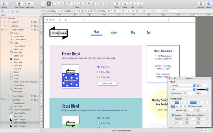
Create beautiful graphics with this easy to use program packed with the power needed to create a stunning sitemap. It works only with Macs, and the team behind it fully supports everything that it has to offer. The Standard version can be purchased for $99.99, while the Pro version will set you back $199.99. While all of the basics are available in the standard version, Artboard layers, converting lines to shapes, and converting text to shapes are available in the Pro version. The standard version will give you line, shape, text, and pen tools as well as more advanced options like a precise geometric positioning and automatic layout. Also take advantage of the text objects, positioning and alignment, default templates, smart guides, manual guides, position snapping, and even distance ruler guides. The unified sidebar allows you to get down to business quickly with all of the organizational tools that are necessary for making an exemplary sitemap. Enjoy a free 14 day trial when you download the program. With this, you are able to share mockups via messaging to a friend or team member, or you can export any finished assets for a project in the preferred format. It is quite easy to get started, but packs a lot of power when you are ready to really dive in.
3. PowerMapper
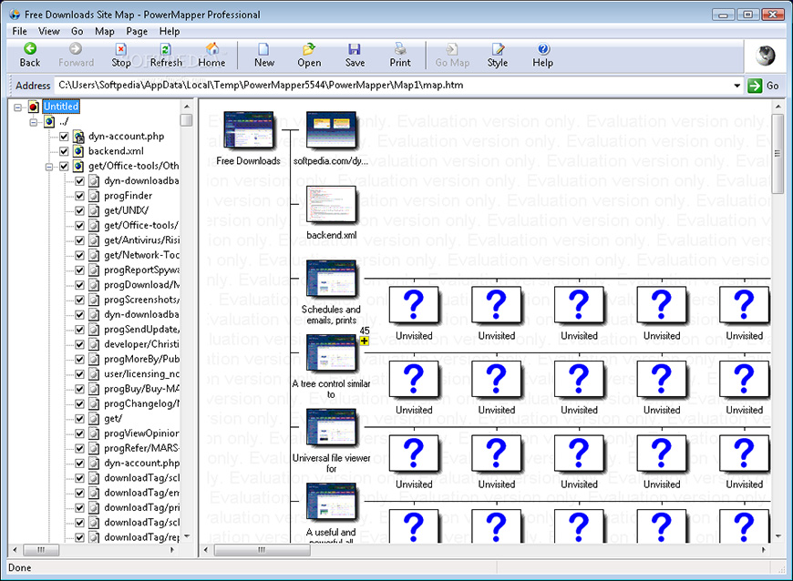
More than just a site mapping tool, you will be able to map, test, and analyze your website when it is ready. PowerMapper boasts use in over 50 different countries by some of the most well-known organizations, like IBM, NASA, Bank of America, and Boeing. Use stunning graphics to generate a sitemap through reverse engineering of existing websites. It will scan all of the website’s pages and capture things like thumbnails and metadata for every page, and then it will draw these on a map. When the sitemap is created, it will display each page as a block, as the taller blocks are those that represent a page closest to the home page. It is great for detecting the website’s structure to see where most of the content is located within the website. You may also view the sitemap in a hierarchy or in an isometric view. With SortSite, you can check a sitemap for any broken links, compatibility with browsers, spelling errors, accessibility, search engine issues, and even web standard validation. Enjoy a free trial or purchase the program, know that it is used by information architects, web developers, and usability analysts around the world, and used by about 30% of the Fortune 500 companies. Use on Windows or Mac to create your own sitemaps. It is so easy to use—all that you have to do is use the built-in web browser to navigate to your website, and then just click on Map. It will work to produce your sitemap in a very short amount of time.
4. Microsoft Visio
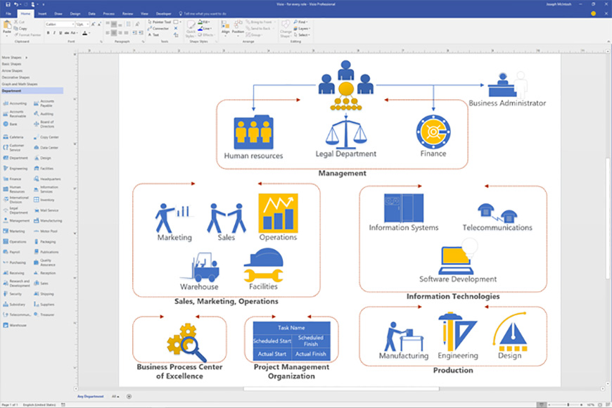
Marketed as a flow chart creator and used by masters, create professional sitemaps utilizing all that this program has to offer. There are pre-made templates along with 250,000 shapes included within the program. You can also easily collaborate with ease on diagrams—it is possible to work together via Skype for Business. Diagrams can be made with a handful of different colors, icons, text, and graphics. When finished, share the project with anyone with a simple link within their browser. The newest version of Visio includes a plethora of new features like one-step connectivity to Excel data, protection for Visio files, shapes that have been modernized for office layout, information rights management, detailed shapes, updated shapes, and even new themes for the Visio interface.
5. Xtreeme SiteXpert
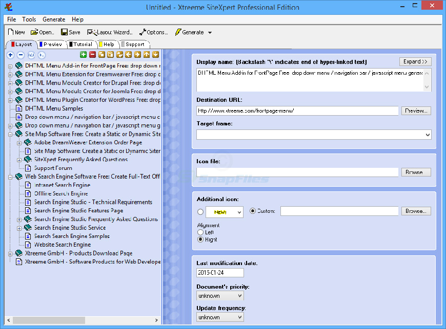
Create and keep sitemaps that stay up-to-date and are usable across different browsers quickly and easily. Create these sitemaps that are compatible with each major browser thanks to the highly optimized code. There is a plethora of different navigation styles, but you can edit the appearance of the menu so that it fits what you want and need for your sitemap. This sitemap creator comes with the generous price of free, as unsupported software. There are tutorials and help documents available to aid in resolving any questions that you may have during the sitemap design process. Users will also receive a demo version of DHTML Menu Studio in addition to a demo version of Search Engine Studio.
6. SmartDraw
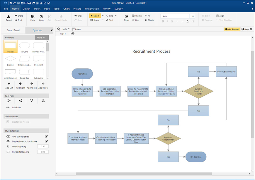
Sometimes called the more affordable alternative to Visio, Smartdraw boasts free support with thousands of different templates. This is a powerful program that has examples built-in, along with drawing tools that help in creating complex diagrams. The templates included in the program work for making over 70 different kinds of diagrams, charts, and other kinds of visuals. In addition to this, you will be able to see thousands of examples that are there to edit and you can make your own. Top brands that trust Smartdraw include Nestle, FedEx, Tesla, GM, Mayo Clinic, and Kraft. You don’t have to be a huge brand to use this program though—anyone is able to create charts and diagrams on a professional level in just a few clicks. Build diagrams by inserting shapes, moving them around on the page to where they will align perfectly. Create your own theme or pick from a pre-made template, but either way you will create your sitemap in just a snap.
7. A Piece of Paper and Pencil
With the advancement of technology, it may seem a bit odd to revert back to pencil and paper for planning, but it is the simplest, quickest, and most effective way to build a sitemap anywhere, anytime. You don’t need a WiFi signal, batteries, or a cord to build a sitemap using this tool. To make your sitemap using a pencil and paper, all that you need to do is list out your content items and ask those around you to draw circles around items in similar groupings. This is a great way to aid in creating information architecture optimization and analysis. In this same theme, you could use a large whiteboard or chalkboard, or even an easel and drawing paper or index cards.

8. Online Whiteboards
A simple yet powerful information architecture tool is online whiteboards. There are so many variations available online, but they all do basically the same thing. They allow you to display content items and encourage other people to group them into like categories. You will create these content item lists, and then invite individuals to work with you by drawing circles around those that are in similar grouping. Online whiteboards are amazing tools that aid in obtaining user feedback on a sitemap.
Here are a few examples of online whiteboards:
Thinkature
GEs Imagination Cubed
9. PowerPoint
PowerPoint is pretty much universally available like some of the other tools on the list. This program includes a feature called OrgChart, allowing you to create your lists of content items that will be grouped through the use of connecting lines or boxes around the content items. The only consideration to be had with PowerPoint is that if you possess a large number of content items in your lists, it is possible that you will run out of room on a single page. One trick to be used in combating this is to make a custom page size that is larger than a piece of standard paper. Considering that shortcut, do know that printing on a larger scale can be a bit problematic, so note this if your website has hundreds of items to list that will not fit comfortably in this format.
10. Excel
Almost every single business and thousands of individuals have Microsoft Excel included in their own software package. Considering this, it is widely available and can usually be accessed anywhere. Because of its wide availability and usability, this makes it a wonderful tool regarding information architecture optimization and studies. Using Excel, you will create lists of content items and then ask individuals to take the content cells and put them into groups. This method is quite fast and virtually free, a great way to create or check one’s information architecture. Excel has hundreds to thousands of cells, making it ideal for extremely large websites that have hundreds of content items, sometimes even per page. If you do not own Excel, chances are that you know someone who does.
11. Google Adwords Suggestion Tool
When you are putting together your information architecture along with your sitemap, you may run into a problem of finding the terms that you will need to include, or what terms pair up or go with other terms, consider this tool. It is used mostly by Search Engine Marketers to discover related terms to post advertisements on via Adwords. It is a great, free tool to aid information architects infer variations or sub-sets of content items through main items. You will also find “additional keywords to consider”, and these are sorted by relevance, allowing you to create related content concepts quickly when you need to. When using the Adwords Suggestion tool, ensure that you are leaving the “Use synonyms” checked (it will be by default), allowing the tool to reckon the variations of the terms that have been entered.
12. Look at Your Own Search Results
There is so much information architecture data available right in the search results listing of a web site—all websites should have this capability. Many web site tools that log analysis will allow you to see the terms that visitors to your website are searching for within your website. This information is available right from your own website and is ranked via the number of times that each of the terms is searched for. You will then be able to determine what type of content is missing from the site or too hard to find on your website. Your own search results are a good way to find what is missing in your information architecture so that you can fill it in with usable and helpful content.
13. xSort
A Mac-only program, using this you will be able to create and group numerous content listings through the use of a computerized version of the well-known 3 by 5 index cards on a table. This is great to use when conducting your card sorting task. It is so easy to use, most participants will be able to easily use this method and you will be able to more easily identify for the perspective of the user what the proper grouping will be for the content items. It is free to use, and the company is actually working on a new web-based version of the program. For now, users can control every aspect of the sort, and create, read, print, and then export all reports with just a single click. The app supports exercises that are open, semi-open, and close, and will give statistical results that are updated in real time.
14. StickySorter by Microsoft Office Labs
This tool is another free way to sort your lists of content into groups. Essentially it is a computerized version of sticky notes, allowing individuals to move the content concepts around into their like groups. If all that you have is a computer, this is a great way to explore new variations of an information architecture. Unlike a great deal of other tool, you will have to download the StickySorter program to be able to use it on a current version of Windows. This is beneficial because it is powerful enough to export large amounts of data through .csv files, organizing large amounts of content into their appropriate categories through the use of sticky notes, one of the most notable visual representations. This is a great alternative to real sticky notes that can clutter a table quickly. They can be separated into different groups, they can be color coded, they can be arranged, sorted through, and formatted with data fields. One of the only shortcomings though, is that the sticky notes can’t be arranged on the desktop but that should be fine when building a sitemap within the program.
15. Treejack
Treejack uses the technique of tree testing for measuring the findability of topics on a website. This is also referred to as card based classification or reverse card sorting. It is done through a simplified version of the website that is text-only, allowing there to be no outer influence from the visual design or navigational aids. It has been said that Treejack is the place to find the most beautiful, comprehensive, and insightful tree test results. You will be able to look at each task the participant did, if they found the correct answer, and if they arrived there directly, and how long that it took to do that. The program was designed by individuals with years of experience in research of user experience consulting, making it a quick and easy method to run a remote card sort. Some of the world’s largest companies utilize Treejack, including Google, National Geographic, and BBC and is used in over 106 countries in over 30 different languages.
Information Architecture Templates
16. Jesse James Garrett
Diagrams are a vital tool for transmitting information architecture as well as interactive design in a website development team. JJG will help users to understand the thought processes in developing these diagrams, the outlines, as well as basic symbology to be used in information architecture diagrams and interaction design concepts and will provide guidelines to be employed when using these elements. You will learn about a visual vocabulary, which is the set of symbols that will be used to describe something in the sitemap. The simple page elements available are pages that are represented by a rectangle, a file that is represented like a letter that has been doggy-eared, a pagestack, and then a filestack. Using these, you will then be able to create relationships via connectors and arrows. One great things about the JJG templates is that the documents are available in many languages.
17. Visio Stencils
Produced by Microsoft, within this add-on you will find over 300 icons that will aid in the creation of visual representations of within any of the Microsoft products including Office, Office 360, Skype for Business, Exchange Server, Skype for Business Server, Lync Server, and SharePoint Server. There are symbol sets from 2012, 2014, and 2016 available for use. If you find that you are in need of more shapes than those that are contained in Visio, there are a few options. You can choose to search your computer for any shapes that are installed via Visio, or you will be able to search the internet for shapes.
18. Nick Finck Stencils
This is a great resource for those who are familiar with common information architecture practices. The stencils provided through this website are free to use but it is asked that they not be resold. The stencils are made to be used with Microsoft Office Visio 2003 or later. There are wireframe stencils, sitemap stencils, and process flow stencils. The wireframe stencils consist of boxes that will represent image placements as well as navigational features like navigation bars. Some wireframes are only templates that will show how parts of a website will be incorporated into the page. The sitemap stencils consist of boxes that represent pages, and the lines that connect the boxes represent the hierarchy of the site. The arrow stencils are available to convey either one way or two way access between the pages. Process flow stencils are basically flow charts that will explain and define the process within a website or other system. In these stencils, you will find clouds, cylinders, diamonds, or boxes. All of them are free to use, and there are links to other templates and stencils recommended by this maker.
19. Yo! Yo! SEO
This is an SEO consulting firm that will help a business to understand and strategically optimize their own marketing strategies online, with a strong focus on search engine optimization as well as the engagement of the audience. Semantics is the main contributor to online visibility—how they talk, share, and express their needs. The team in made up of search marketing experts that plan and develop very important search engine efforts. This team understands that having a solid information architecture is important to developing a successful website, starting with the content design process. Yo! Yo! SEO provides users with a free information architecture and content planning worksheet template. Included in the worksheet are: page titles, URLs and directory structure, content assets, keywords, social sharing, and link & anchor text. There are two tab included on the worksheet that are tips and how-tos regarding the information architecture and content worksheet and then the information architecture and content worksheet itself.
20. UI8
This can be called a perfect toolkit for all user experience projects. The price tag varies by what exactly you need, but there are so many resources. Using UI8, you will have an uncomplicated way to show the basic flow and features of a project before you get into the complicated process of wireframing. UI8 is a great place to get started. There are about 250 templates, over 500 elements, it has been meticulously designed, it is fully scalable and vector based, and it is compatible with Sketch 3+ as well as Adobe CS6+. There are user interface kits, wireframe kits, pre-built themes, individual icons, fonts, sounds, sketch capabilities, and even some freebies for those who have not committed to the program yet. The great thing about using one of the premade themes is that you will be able to focus more on creating as well as meeting your important deadlines. The Ultimate Pass comes in retailing for $500 and offers a wide selection of the best of the best from the website.
21. InfoTech Research Group
One of the benefits from InfoTech is Guided Implementation. This is one of the most unique concepts to come from creating information architecture. A talented analyst from the team will spend time with you on the phone to coach and assist you at any point in the project. This analyst is someone who wrote the research and can provide valuable insight about key milestones or through any other part of the project. Research shows that each time Guided implementation is used, it saves 14 days of IT resources and a whopping $22,517. With on-site workshops, your projects will be sped up and you will be able to develop or improve your IT strategy. Not only this, but with a workshop you will have the potential to get 90% of any project finished within 5 very intense days. There is a flat rate for these workshops so you know that you will be getting exactly what you pay for. These intense, collaborative learning experiences will help to develop and train your team, and will put you in the ranks with the previous workshop clients that rate the workshops as a 9.8/10. Consulting with InfoTech will get you access to an expansive project-based IT library of research that covers over 400 topic areas, and diagnostic tools that are driven by data. The consulting services merge the insights of over 30,000 members with talents and strategies that have been approved by the consulting staff. InfoTech will not abandon their clients mid-project, they follow up on projects, have ongoing advisory, have routine touchpoints—in essence the clients are always at the forefront of the firm’s mind. If you are not sure about committing just yet, request to have a demo and see what it’s all about.
22. SharePoint
This web-based application integrates with Microsoft Office, and is marketed as a system to manage and store documents, but it is quite malleable and can be used for a variety of purposes. Microsoft SharePoint Standard edition encompasses a few very important features. The Sites portion covers audience targeting, secure storing, governance tools, and web analytics functionality. The Communities portion encompasses the “MySites” portion, tags and notes, organization hierarchy browser, and enterprise wikis. The Content section works to improve upon compliance of record and document compliance, content management, word automation services, and managed metadata. Through Composites, you will find ready-made workflow templates as well as BCS profile pages.
All in All
While the list of these information architecture tools may seem overwhelming when creating a sitemap, but in reality, they all do it differently and vary widely on their cost. The best approach is to think about your budget (both money and time) and decide where you stand. Then, think about what you need from the tool and how much work you are willing to put into it. There is no single program that is right for everyone, but there is a tool for everyone that will match budget, skill level, and commitment. Having a comprehensive sitemap is just a single factor that goes into creating a successful website from the beginning. Chances are that when you have a comprehensive sitemap, it will also lend to having a website that is overall more organized and appealing to visitors. You will be fully aware of all of your content and where this content is, so you can better plan for the future.
Categories
- Last Edited April 17, 2026
- by Garenne Bigby