User Experience
10 Card Sorting Tools for Surveying Information Architecture (IA) Posted 06.12.2017

Is your website organized in a manner that makes sense not only to you but also site visitors within your target market? Nothing can be more frustrating than not being able to find information that you know is available on a site. When content is not where you expected it to be, your website will lose visitors and reputation of being a credible source of information.
Card sorting (and by extension, card sorting tools) is a convenient means of testing your site’s layout and finding out whether or not you need to make any changes that can improve your information architecture.
Read more16 Usability Testing Tools for Optimizing User Experience Posted 01.31.2017
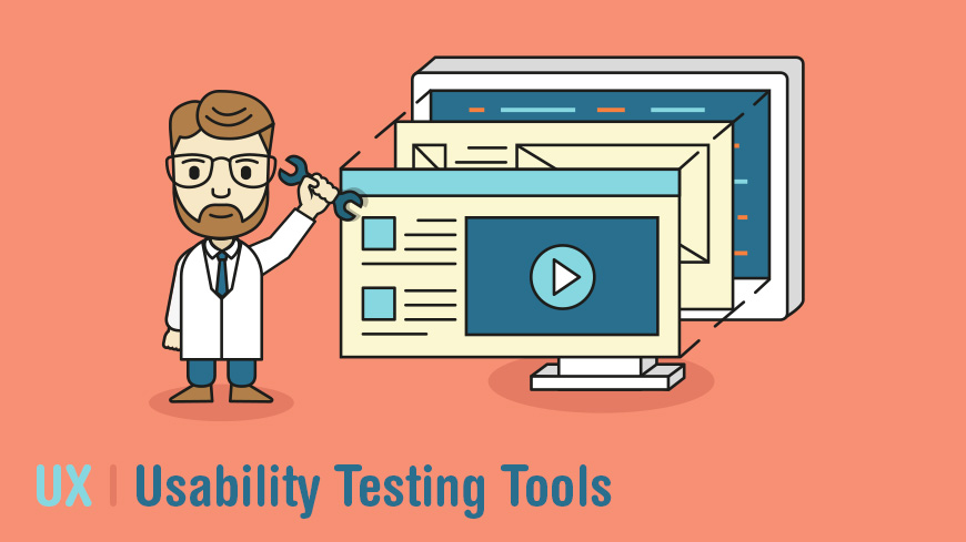
Usability testing tools are vital to a website's success. The user experience relies heavily on user testing, as it helps developers to understand how users interact with the design. In turn, it helps to make the best user experience possible, and aid users in completing their task, increasing conversions overall. Running one's own user testing will include finding and employing a target audience, because of this setting up the necessary hardware can be time-consuming and expensive.
Read more18 Usability Guidelines and Website Design Standards Posted 02.02.2018

Knowing and understanding the guidelines when it comes to usability of your business’s website is a sure way to grow your customer base. Websites that are not user-friendly are not efficient. Simply put, if your website is not friendly for the people who go to your page, visitors will go elsewhere. Making sure your website is easy to access, efficient to use, and includes helpful content are some of the important guidelines to follow. You should also consider having your website tested for usability. When you test your website, you will be able to figure out what is going right, what is going wrong, and what might need to be changed.
Read more20 Ways To Increase Your Website Conversions Posted 07.05.2016
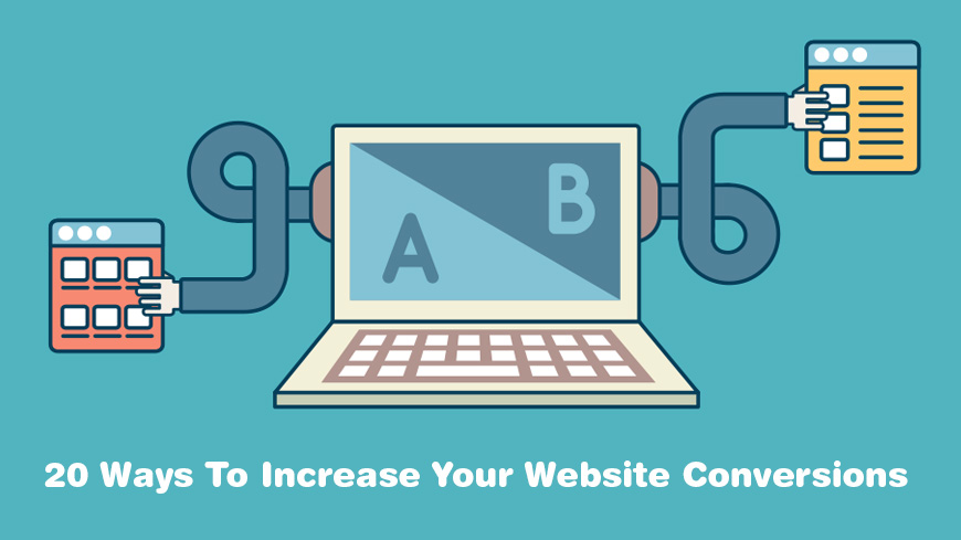
It is vital to increase your conversion rates in order to have a high sales volume and successful business. Many times it is just a small tweak in an established machine that will produce significant improvements among conversion rates. Pair many small changes with a few large tweaks and you can rest assured that your conversion rates will show dramatic results.
Read more43 Awesome Ultraprecise, Proven AB Testing Tools Posted 03.24.2017

AB testing is a randomized experiment that has two variants (A and B) which are the control and variation within a 2 sample hypothesis testing. This kind of testing is a way to compare two different versions of the same variable, generally done by testing the reaction that the subject has to variable A against the reaction to variable B, and then determine which of the variables is more effective. Sometimes called split-run testing and bucket testing, this is a pretty standard test. What does this have to do with website optimization? When you run an A/B test for your site, you are able to test two versions of the same content against each other to see which performs better as a whole—it will lead to more conversions, a lower bounce rate, and a higher retention rate.
Read moreFocus Groups: Everything You Need to Know Posted 10.09.2017

There are many ways to conduct research when you are looking for information including data collection, surveys, interviews, focus groups, and more. Depending on your purpose, focus groups might be an adequate way for you to obtain information from consumers about your product or service and how you can make it better. Just like for all study approaches, it is important you understand what focus groups are and how they can be helpful, as well as the pros and cons of using this kind of research.
While each method serves a different purpose, focus groups can be a way to get information quickly from a larger sampling of consumers, whereas if you are thinking about conducting an interview, you would spend more time with one person and not get as much information. It would be more time consuming to conduct individual interviews with multiple people. In addition, a focus group is a way to obtain qualitative information instead of using a survey that gives you quantitative data.
Quantitative data can be very helpful in some situations, but getting qualitative data can be more beneficial when you would like to understand the behavior and opinions of consumers. Below is more information that can help you to understand if a focus group is the right kind of research for you.
Read moreHow Personas Can Help Your Content Strategy Posted 06.07.2016

What is a persona? This is how a person views things, how they act, what they believe, and the like. It incorporates the most important things that make them who they are, and organizes it into a profile. This is why personas are so important for businesses—they need to know all of these things about their customers. This is when they would create a web persona. Essentially, this would be a fictional profile that represents the target audience according to averages that have been calculated regarding the customer's buying process, their personality, and their demographics. Personas and user archetypes are used by companies in guiding their decisions regarding new product launches, new features, site design, and interactions with customers. It is important that they understand the goals and patterns of the audience in order to create a successful archetype that will satisfy this targeted group. The aim is to make a persona that represents the total package of the target audience. When this happens, it allows the business to appeal to the maximum amount of their real life customers.
Read moreHow to Effectively Plan Your Website's Architecture Posted 04.07.2015
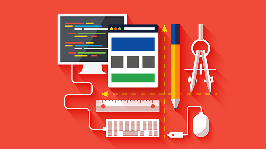
Planning and creating a website’s structure is not an easy job for a large website. There are some specific steps that should be followed. This article will provide you with the main steps to make sure that the website architecture achieves your client’s expectations.
The very first step is tomake a planduring the discovery phase of the website development project. If you do not make a detailed plan then you will most likely end up with a scope creep, unpredicted increases to the project’s scope. They call it project creep because it often sneeks up on you and it is hard to get compensated for the extra work that did not go through the approval process. You will have no base on which to defend yourself against and could waste lots of your time and money. It will help you avoid possible disagreements about the final product; if you follow the plan that was accepted by the client, then it is much easier to finalize a project and get paid.
Read moreHow to Evaluate the Quality of Your Website Design Posted 05.11.2016

Everyone is talking about good website design, but do you know what it actually means? Do you know how to tell if your own web design is working? Do you know what to look for? Without having a clear metric for measuring the quality, it is hard to recognize the quality. There is more to a successful website than simply looking nice or being able to function. Ideally, a successful website would be built with a specific strategy in mind, it is focused on usability so that visitors can navigate the website with success, it incorporates a style that is pleasing to the user's eye, it is filled with content that is relevant to the users, and it is optimized for search engines. Keeping that in mind, these are a few of the key aspects of a strong website design, complemented with some questions that you may ask yourself when measuring the quality of your website.
Read moreHow to Perform a Usability Evaluation Posted 10.02.2017

The function of a usability evaluation is to determine how well visitors to your site are able to discover and explore content, use your site to meet their intentions and expectations, and how satisfied they are with the process. There are a number of ways to determine your usability, whether rating your existing site or planning a new one, but understanding the concept is a crucial first step.
Read moreHow to Wireframe a Responsive Website Design Posted 02.01.2017
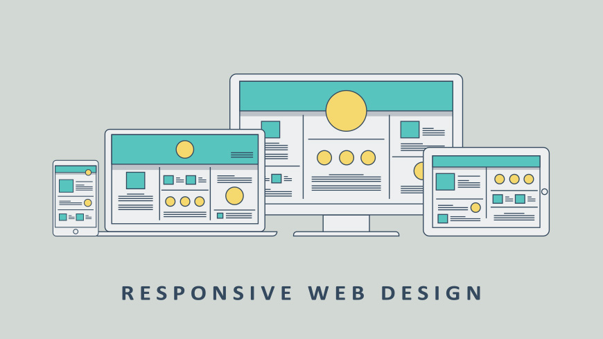
The wireframe of a website is essentially the skeleton of a web page that is assembled using basic shapes, lines, colors, and styles. The point of a wireframe is to focus on making a layout conducive to the content placement while, figuring out functionality and navigation problems in a format that can be adjusted easily. When planning a design for a responsive website, it is not possible to think of the wireframe from the perspective of a desktop, but changing the way that these layouts are constructed and regarded does come with its own challenges. For years designers have made wireframes fit for computer screens. When making wireframes for mobile devices first, this helps webmasters to prioritize elements on the website when it will be shown on a smaller screen.
Read moreThe Definitive Guide to Card Sorting Posted 09.22.2017

If you’ve ever visited a site that was disorganized or you couldn’t find what you were looking for (even though you know the information is there), you’ll understand how frustrating a bad layout can be. You may even have decided to stop using that site and changed over to a different company with similar services as a result.
If this has happened to you, you understand the importance of categorizing your own site’s content in a manner that makes navigating to the desired pages an easy matter—because you don’t want to lose clients, of course!
But how do you know whether your site’s layout and categorization is as easy for your users to understand as it is for you? After all, you built the site (or at the very least gave your developer/website manager directions in doing so), and therefore know where to find everything, but your target market may have a slightly different way of thinking. And if your users struggle to find your content the way you’ve grouped it, they too may consider moving on to a competitor. This is where card sorting (and card sorting software or sessions) saves the day.
Read moreTop 15 User Experience (UX) Certification Programs Posted 09.28.2017

If you own a site or are thinking of starting one, you’ve likely come across the idea of “user experience.” User experience, or UX, is an integral feature of website design and layout. After all, when you visit a site online, you want to enjoy the experience. You don’t want the web pages you’re viewing to be crowded with too much information or ads, and you certainly don’t want to have to hunt for the information you need either.
So when it comes to owning, managing, or building a site, UX is an important consideration. But as you may well know, not everyone experiences life—both online and offline—in the same way. What works for some does not necessarily work for others.
There’s a running joke that in order to become a UX expert, you need to have experience, curiosity, a portfolio, superior communication and research skills, a working knowledge of social psychology and… the list goes on.
All jokes aside, UX isn’t about learning just one formula. There is no one master trick. Mastering UX means knowing about a wide range of things—hence the “requirement” of curiosity.
Lucky for you, you won’t have to enroll in several courses and complete two or three degrees. Learning UX has never been easier than right now.
Read moreUX Careers 101: The Guide to User Experience Careers Posted 04.15.2016

User Experience, also known as UX, is absolutely one of the fastest growing and possibly most exciting parts of the interactive industry. There are many facets to a career in the user experience, and all of them are deeply rooted in a passion for not only knowing users, but being able to shape their experiences into the best that they can possibly be. In this guide for UX careers, you will find essential information about the various career opportunities around UX, the national benchmarks set for such salaries, the best areas for jobs in UX, and essential tools of the trade for those User Experience professionals.
UX Tools Posted 01.23.2018
By definition, UX (or user experience) refers to how a person feels about their interactions with a specific product or service. It can include their emotions that have been generated from the experience or their attitude and feelings in relation to it. It can be completely subjective to each individual due to how people think, feel, or interpret things differently from one another. What works perfectly for one person can be highly unappealing to another. This can make it difficult for a company or brand to meet the needs of each individual person their product or service reaches.
Read moreCreate Visual Sitemaps
Create, edit, customize, and share visual sitemaps integrated with Google Analytics for easy discovery, planning, and collaboration.
Popular Tags
Search Engine Optimization SEO Accessibility Testing Create Sitemaps Sitemaps UX User Experience Sitemap Generator Content Audit Visual Sitemap GeneratorGet Started with DYNO Mapper
Join thousands of professionals using the most advanced visual sitemap tool to simplify discovery, IA, and content planning.
👉 Start Your Free Trial — No credit card required.
