
How to Wireframe a Responsive Website Design
Last Edited September 11, 2023 by Garenne Bigby in UX
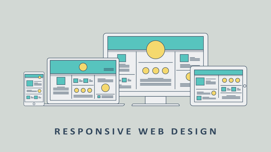
The wireframe of a website is essentially the skeleton of a web page that is assembled using basic shapes, lines, colors, and styles. The point of a wireframe is to focus on making a layout conducive to the content placement while, figuring out functionality and navigation problems in a format that can be adjusted easily. When planning a design for a responsive website, it is not possible to think of the wireframe from the perspective of a desktop, but changing the way that these layouts are constructed and regarded does come with its own challenges. For years designers have made wireframes fit for computer screens. When making wireframes for mobile devices first, this helps webmasters to prioritize elements on the website when it will be shown on a smaller screen.
A responsive design is one that allows for the ease of use navigating a website or application on a mobile device or smartphone, rather than a desktop. It allows developers to prioritize the elements of their website while deciding what content is the best to have on their website. It is important to consider the goals of the client when deciding on the importance of each piece of content within the website. This is what decides which elements are of the most importance for those on desktop versions of the website as well as on the mobile version.
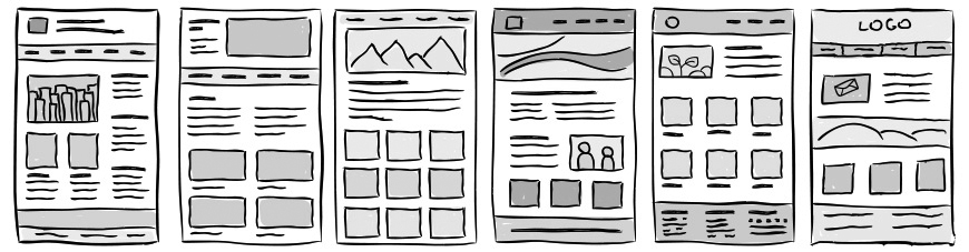
In general, a wireframe is not on color because the focus needs to stay on the relationship of the various elements and not on the actual design. The designer is the one that will be working on the color and shapes once the wireframe has been established. They will need to stay in the loop, so that they can successfully render the mood and mission of the color once the skeleton has been established. Building a wireframe is not an exact science, and there will usually be times when numerous revisions are done until the client feels comfortable with the layout. Because of this, it is important to note the logic behind the wireframe layout so that the client and development team will be able to see the rationale.
Tools Needed For a Wireframe
The first thing that needs to be done for a good wireframe design is for ideas to be drawn out to determine where all of the different elements should be placed on the page. There are many types of tools available to help with wireframing, as well as apps that make the process speedy and simple. If using a program is not something that you will be doing, simply using a pen and paper will be sufficient. This seemingly primitive method is a great way to get all of your ideas out on paper, as you are able to quickly illustrate your ideas. It has been said that the lack of style in the wireframing portion of the process will keep the client from being over-particular about the precision of the layout.
Things to Avoid
- Wireframing is a combination of thinking problems through and defining interfaces. Like all aspects of a developmental process, there are pitfalls to wireframing when it is not done in the proper manner. These are some of the things that you should keep in mind when aiming to create a responsive wireframe.
- Do not emphasize design and color. The purpose of a wireframe is to decide on the layout and where elements will be located on the website. When the work is done in black and white or greyscale, it helps to keep focus on the main reason for doing the process—finalizing the layout not the design. It is better to start with a simple wireframe, as it is easier to work with when things need to be moved around.
Keep Details to a Minimum
It is always possible to add in more details to show the project to clients later on in the process, but having too much detail in the beginning stages can lead to confusion. When drawing the wireframe on paper, this is a great way to get started and a rough sketch will allow for quick changes to make the solutions more interesting.
Don't Wireframe Every Single Page
In general, it is not required to wireframe every single page view. It is important to know the content of the website so that there is a clear idea of what the website and user is trying to achieve. The important information gathered from content audits, stakeholder interviews, and research are all vital in prioritizing the elements on the web page. Not all pages need to be wireframed, as long as what is done will help to move the project forward.
Benefits of Wireframing
A wireframing project is a vital tool for communication on a web or application project. It allows the developer, designer, and client to view the construction of the website without having the distraction of the design elements like images and colors. Simple wireframes will say time in the long run and will make the developmental process easier for all individuals involved. These are some of the great benefits of having a wireframe:
A wireframe will get the client thinking about what it is that they need for their site, and will help them to define their project's end goals as well as what the primary focus will be. They bring clarity to the project and allow you to work on all of the interactions and layout needs of the site.
Having a wireframe on hand for a project will make it easier for the webmaster to communicate their ideas to the team, and how it would work in terms of responsiveness. Wireframes will also help to deliver the main message of the website in the most effective way, and will allow for feedback to be gathered on the early stages.
The developer will be able to have a clearer and concise picture of the elements that will needed for coding. It will answer questions like how does the layout need to be adjusted for a smaller device, what is the content hierarchy, and how does the navigation work with screens that are smaller? Designers will be able to plan the layout of many sections within the site, which will then make the process flow quite better.
Tools for Responsive Web Design
Today it is rare when a website is not fetched by some sort of mobile device or smart phone. Because of this, smart web designers will utilize responsive web design as a remedy for all issues related to layout or typography. Having a responsive website saves time, money, and effort in the grand scheme of things, but it also gives the mobile users the same consideration for ease of use that desktop/laptop users are used to. Wireframes, Prototyping, and Layout - these are the first things necessary when thinking about how all of the elements on a page will be placed.
Responsive Design Wireframe Tools:
1. Responsiveness Wireframes
This is where you can learn how to produce design elements that will work productively within the layout, and you will be able to determine the areas of the layout will get the center point of the website across different types of devices. The program offers wireframe mockups for both desktop and mobile versions that have a homepage, promo entry, guided entry, comparison pages, and product detail. There is a Toggle button that allows you to see how the different elements will change depending on the device that they are being viewed on.
2. Wirefy
This is a great option for those developers that are focused first on the content, then on the layout. The content can be planned and structured, and the wireframes allow for the client to see exactly how their responsive website will work and look to users. The only caveat is that you will need to have knowledge of HTML and CSS as well as a basic code editor.
3. Interface Sketch
On here, you will be able to sketch a layout, much like how it is done in a notebook with a pen and paper. There are many free printables available for many of the most-used mobile devices today from desktop browsers to tablets.
4. Bootstrap
Prototyping is painless with this program that was built by the same designers that built Twitter. Users are able to choose the specific responsiveness elements that they want to make up the page. Then, download the completed version with compiled and compact CSS, plugins, and other elements necessary to simplify the work.
5. Style Tiles
This is clearer than a simple mood board, but it does not require as much labor as a full mock-up. It will bridge the gap between a wireframe that a designer makes and the style that the client is asking for. The user interface is similar to that of Photoshop, as you can adjust the layout, logo, and colors to fit each project's needs.
Making Graphics, Fonts, and Videos Responsive
Having the layout as a whole made to be responsive is one thing, but is it possible to make graphics, text, and movies responsive? Actually, yes! These are some of the tools available to help make this process easier.
1. Retina Images
This system is so easy to set up. It will display a high resolution image as an alternative on a device that supports it. It will only download one image at a time so that there is no long, drawn out load time on the server for images that may or may not be displayed.
2. Adaptive Images
This program will read and interpret the screen size of the viewer and will then automatically scale the embedded HTML images up or down to be optimally viewed—with no additional markup needed. There are only 3 simple steps within the program to make this happen.
Testing Responsiveness
You have built a wireframe and it has been approved by the client—now it needs to be put to the test. The layout suits the needs of the user, and you have coded it to perfection—maybe. You are ready to show it off to the world, but has it been tested properly? These are some of the tools that you can use in order to test the responsiveness.
1. Responsinator
Here, you will be able to see how your website looks and loads on a wide variety of mobile devices. All that you have to do is enter the URL of the site to see precisely how a mobile browser will see it, for both landscape and portrait views.
2. Matt Kerley's Responsive Design Testing
This is one of the most popular responsive testing tools available on the internet. It can be used with any website, making it ultra-flexible. It is even capable of being installed on one's own server so that troubleshooting can be done faster. The widths can be tested for the breaking points of the content, and the height and width can be tested against that of popular mobile devices.
All in All
Developing a wireframe for a responsive website is one of the most beneficial steps that can be taken to ensure the success of the website. More and more, users of the web are accessing sites from their mobile devices and only using their desktops as a back-up. Because of this, websites should be optimized for use by a wide variety of devices, and the best thing to do is prepare the website from the ground up based on this idea. It is possible that a client is not interested in seeing the wireframe, but it is still vital in creating it so that all developers involved in the project are on the same page.
Responsive design is challenging web developers in the way that they think about planning web pages—these pages need to be able to be used successfully with a number of different devices, and that number will likely keep growing with technological advances.


Related Articles
- 18 Usability Guidelines and Website Design Standards
- UX Tools
- Focus Groups: Everything You Need to Know
- How to Perform a Usability Evaluation
- Top 15 User Experience (UX) Certification Programs
- The Definitive Guide to Card Sorting
- 10 Card Sorting Tools for Surveying Information Architecture (IA)
- 43 Awesome Ultraprecise, Proven AB Testing Tools
- 16 Usability Testing Tools for Optimizing User Experience
- 20 Ways To Increase Your Website Conversions
- How Personas Can Help Your Content Strategy
- How to Evaluate the Quality of Your Website Design
- UX Careers 101: The Guide to User Experience Careers
- How to Effectively Plan Your Website's Architecture
Create Visual Sitemaps
Create, edit, customize, and share visual sitemaps integrated with Google Analytics for easy discovery, planning, and collaboration.
Popular Tags
Search Engine Optimization SEO Accessibility Testing Create Sitemaps Sitemaps UX User Experience Sitemap Generator Content Audit Visual Sitemap Generator
Get Started with DYNO Mapper
Join thousands of professionals using the most advanced visual sitemap tool to simplify discovery, IA, and content planning.
👉 Start Your Free Trial — No credit card required.