
How to Create a Landing Page that Converts
Last Edited September 11, 2023 by Garenne Bigby in UX
A landing page is essentially any web page on the internet that a visitor can “land” on. When being discussed between marketers and advertisers, the term landing page would be referred to when talking about a standalone web page that has been designed for one single objective, and is distinct and essentially separate from a main website. What does this mean? In short, the landing page should not have any global navigation that would tie it to the primary website. Why would a website want this? Using a landing page like this will limit the options that are available to the website visitors, and will help guide them to the ultimate conversion goal.
Landing Pages
There are two types of landing pages— Click Through and Lead Generation (also known as Lead Capture pages or Lead Gen).
Lead generation pages are used when the goal is to capture user data like their name and email address. The only purpose of this page is to collect the information that will allow the brand to connect with and market to the prospect at a later date. When this happens, the lead capture page will be comprised of a form alongside a description of what benefits you will be receiving when submitting the personal data. Many brands use these lead capture pages, including those used for: registering for webinars, ebooks, coupons or vouchers, free trials, content entries, notifications of a subsequent product launch, and even to claim a physical gift. The information that is requested on the form used on this landing page will have a direct effect on the conversion. Aim to ask for the minimum amount of information that is necessary for you to market to potential customers effectively.
Click through landing pages have the primary goal of influencing the website visitor to click through to another web page. These types of landing pages are generally used in e-commerce funnels, as they provide a platform for the brand to describe their product or offer in much detail, essentially warming the visitor up to the point, aiming to influence their decision pushing them closer to a purchasing decision. Many times, incoming advertising traffic is steered toward a registration page or shopping cart. This habit leads to poor conversions, due to the fact that the ad does not provide enough information for the visitor to make an informed conclusion about the brand. This is when the click through landing page is best utilized. The landing page will contain all of the vital information, and the destination page would then be the registration page or shopping cart—being met with a higher chance of conversion thanks to the details on the landing page.
Breaking Down the Landing Page
Landing pages that are used for marketing can be broken down into clearly defined elements. These are the building blocks representative of the foundation of most pages, and can be used as a rough outline when shaping and creating content. There are 5 core elements that should make up any landing page, and these 5 elements can then be broken down into a more detailed list of essentials. The USP, the hero shot, the benefits of what you offer, social proof, and the call-to-action (conversion goal).
The USP
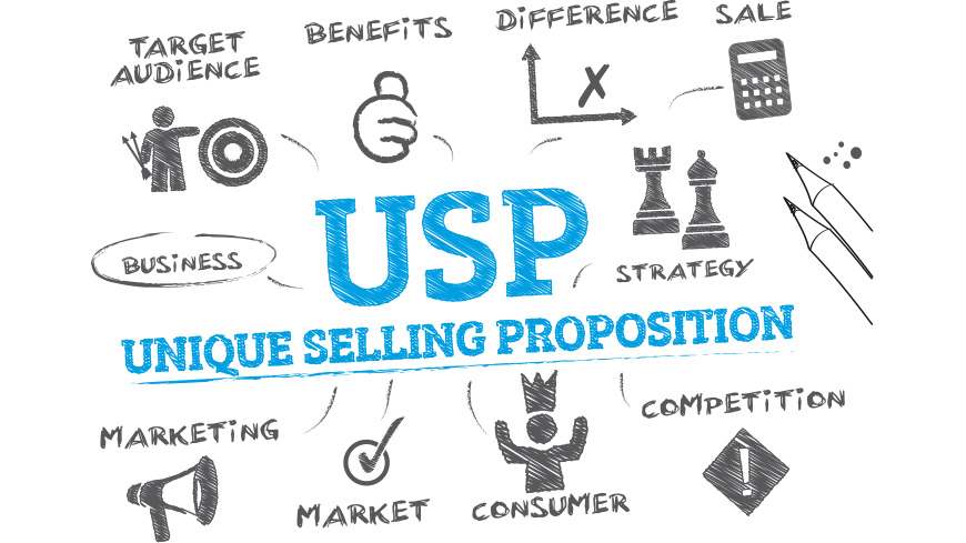
The Unique Selling Proposition (USP) will be made of the main headline, a supporting headline, a reinforcing statement, and the closing argument. Every marketing campaign has the same starting point—their ability to differentiate themselves from other marketing campaigns. This is what makes their service or product different from the competition. This needs to be communicated in a clear and concise way on the landing page. Aim to break the offering down to the most basic level, and describe the specific benefit that your product or service has for the customer. A USP that is crafted ideally will lay out clear expectation for the customers and will let them understand why this product or service is important. This can be seen in marketing campaigns that boast food delivery in a specific amount of time, or it is free.
There are 4 page elements in a USP. These elements will all make up the story of what you are offering through the landing page. The primary headline is the very first thing that visitors will see and then read. It is vital that this clearly describes what the visitor will get from the website (this is the goal) and the message match should be strong enough to show the website visitor that they are in the place to reach this goal. Because the primary headline should be short and sweet, the supporting headline is used to clarify the primary. It can be used as an extension of the primary headline, as if it is finishing a sentence, or it may be extended in a way that applies an added persuasive message that will support the primary headline. The reinforcement statement will be about halfway down the page, and will serve as a mid-experience reminder of the brand's message. Think of it as a second headline. A reinforcement statement is necessary because people can websites when they are reading. This means that it is very important that all titles stand out to the reader. This includes main headlines, feature titles, and benefits titles as well. The final chance for a brand to communicate the benefits that they offer is in the closing argument. It is not necessary for a short web page when the headline is still visible. The closing arguments will once again reinforce the main values and proposition.
The Hero Shot
The hero shot is how the brand is represented visually. It will incorporate what the brand offers with how it can help individuals to gain more understanding of what it is or looks like. For the best effect, it would show the context of use—showing rather than telling how the product or service is to be used by the customer. The goal with this is to get the customers to place themselves in the scenario in which they are using the product or service. This can be done with either photos or videos. When using photos, show the product in by itself, but also add extra effect by adding in pictures of someone unfolding the ladder, using it, and placing it where it should be stored when done. A video would provide an even more compelling showcase of the product. Think of every infomercial you've ever seen. They are cheesy, but they display the sense of need by showing the direct benefits to be had in everyday life.
What is to Be Gained?
Focus on the question “What will this do for me?” And answer it. This helps copywriters to speak in a way that is directly to the customer. This will be a more detailed description of the product or service's features and benefits. When the headline is crafted effectively, in this section you will only need to provide a bit more detail about what is offered, and must answer any questions that may arise. This section could turn into a wall of text, so try breaking it up just a bit. Ideally, write one brief paragraph that summarizes, and then add 3 to 5 bullet points that will provide clarity. It is okay to return to this section as many times as needed to edit out anything that becomes unnecessary, or add in information as it becomes available.
A good benefit section will have statements that are written as an actual benefit, and will not be feature based. Here you will also detail the feature and benefit descriptions. To support any of the claims that have been made, provide a more detailed overview of the purpose and benefit. A good way to think about this is to stick with expanding upon the benefits first, and then add feature details if needed below. You will want to focus primarily on the benefits first, and then describe the features. The description of features is more directed at the visitors that will require a bit more detail in order to make their buying decision.
Social Proof
This persuasive concept is very important. Social proof uses social signals to exemplify how other people have consumed, purchased, read, or participated in whatever it is that the brand is offering. The thought process behind this is that individuals are more likely to convert into purchasers if you see that those who did before you are glad that they did. What can be used as social proof? Provide numbers like how many customers you have, provide testimonials, boast social signals like how many followers you have, note any awards that have been received from reputable organizations, and publish real customer reviews.
Call to Action
Sometimes known as the conversion goal, this will describe what the purpose of the page is to the brand. It serves no purpose other than to remind the brand why they are designing their website. To a website visitor, this would be a call-to-action. This may be a standalone button or a click through page, it may even be part of a lead generation form. The call to action is what drives the conversions—it is the target of the website's conversion goals. This is what the brand wants the website visitors to interact with on the landing page. It is so important to consider there it is placed and what it will say.
In the business to business marketplace, the purpose of the landing page is to be the generating of leads. This generally includes asking the visitor for their name and email, and in return they will receive a piece of content. When requesting information from visitors, keep the form short and include a privacy statement. CTA's that are poorly written contain only “SUBMIT” or “CLICK HERE” while a good example would say “Get your valuable coupon” which clearly states what the visitor will be receiving in exchange for their information.
Take Home Points
Do not ever use a homepage as a landing page. Generally, a homepage will have too much information, making the visitor feel lost. It is also recommended to not use the main site product page as the landing page either. Even when the homepage and subpages are perfect, a devoted landing page performs better at converting the website visitors into leads because they can focus on one single task.
The purpose of the landing page is to keep them there until the desired action is performed—so limit the extra navigation. If this added navigation is visible will encourage them to look past the CTA. Get rid of the main website navigation from the landing page so that they won't move on from the landing page too quickly.
The objective of the landing page needs to be clear and simple. Do not try to add a lot of information to the landing page, it will do no good. Make it clear what the brand wants toe visitor to do, and what the page is about. Only use the necessary media, links, copy, and images on the landing page while organizing the content into a logical structure. The CTA must be as obvious as possible for the visitor.
The content should match what the visitor has previously seen. When there is disconnect between messages, a website's visitor will feel that they are not in the right place and will typically hit the “back” button.
A landing page should never be a fact sheet or “Contact Us”. It can however be a free trial, valuable guide, or even a demonstration. It must be something of value that is appealing to the customer. This will generate more leads so that the visitor can be nurtured until they are ready to buy.
Don't be afraid to change the landing page as often as needed. Create a new landing page for every new offer or campaign. This means that there are more opportunities for converting traffic into leads.

Create Visual Sitemaps
Create, edit, customize, and share visual sitemaps integrated with Google Analytics for easy discovery, planning, and collaboration.
Popular Tags
Search Engine Optimization SEO Accessibility Testing Create Sitemaps Sitemaps UX User Experience Sitemap Generator Content Audit Visual Sitemap Generator
Get Started with DYNO Mapper
Join thousands of professionals using the most advanced visual sitemap tool to simplify discovery, IA, and content planning.
👉 Start Your Free Trial — No credit card required.